







Stock Price Chart Patterns, Explained and Illustrated- 38 Chart Patterns
A complete, colour-coded reference to every major stock chart type, candlestick pattern and classical chart pattern used in technical analysis — what each one shows, when it applies, how to read it correctly, and which one fits your specific trading or investing goal.
Stock Chart Types
Before reading any pattern, choose the right lens. The same price history looks different — and emphasises different things — depending on which chart type you plot it as.
Line Chart
Connects successive closing prices into a single continuous path.
When to use it
Best for a fast read of the long-term trend, for comparing two or more stocks or an index on the same scale, and for cluttered dashboards where intraday noise would distract from the big picture.
How to read it
Follow the slope: a rising line marks an uptrend, a falling line a downtrend, and a flat line a range. Because only the close is plotted, ignore it when you need to judge a single day’s volatility.
A line chart of Nifty 50 over five years shows the broad structure of bull and bear phases clearly, without the visual noise of 1,200+ daily wicks.
Bar Chart (OHLC)
Each vertical bar plots the day’s high-low range, with a left tick for the open and a right tick for the close.
When to use it
Useful when you want full open-high-low-close detail but prefer a cleaner, lower-contrast look than candlesticks — common on professional order-execution and market-data terminals.
How to read it
Read the tick marks: open on the left, close on the right. A long bar with the close near the top signals strong buying through the session; a long bar with the close near the bottom signals strong selling.
A trader scanning a Bloomberg-style OHLC bar chart of a banking stock can spot a strong-close day (close near the bar’s high) ahead of results without needing candle colour.
Candlestick Chart
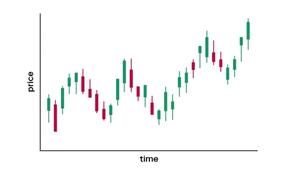
The most widely used chart in equity research: a coloured body shows the open-close range, thin wicks show the high-low extremes.
When to use it
Use it as your default working chart for swing trading, pattern recognition, and any report where you need to communicate sentiment (buyers vs sellers) at a glance.
How to read it
A green/hollow body means the close was above the open (buyers in control); a red/filled body means the opposite. Long wicks show rejection at that price; a small body shows indecision.
On a stock like Tata Motors, a string of long green bodies with small lower wicks during an earnings rally visually confirms sustained buying pressure session after session.
Heikin-Ashi Chart
A modified candlestick where each candle’s open/close is averaged with the prior candle, filtering out short-term noise.
When to use it
Use it to stay in a trend longer without being shaken out by every small reversal candle — popular with positional and trend-following traders.
How to read it
A run of candles with little or no lower wick signals a clean uptrend; a run with little or no upper wick signals a clean downtrend. A small-bodied candle with wicks on both sides warns the trend may be pausing.
During a multi-month rally in an IT stock like Infosys, Heikin-Ashi candles typically stay solid green for weeks, only flipping colour once momentum genuinely fades — useful for staying invested through minor daily wobbles.
Point & Figure Chart
A simplified, illustrative grid of X columns (rising boxes) and O columns (falling boxes) that ignores time and small moves below a fixed box size.
When to use it
Use it to filter out noise entirely and focus purely on significant price moves and classic support/resistance breakouts, especially for identifying long-term accumulation or distribution zones.
How to read it
A new X column starts when price rises by at least one box size; a new O column starts on a reversal of a set number of boxes. A tall column of X’s breaking above a prior column’s high is a bullish breakout signal.
Analysts screening for long-base breakouts sometimes use Point & Figure counts to set price targets, since the horizontal width of a base can be used to project the move once it breaks out.
Renko Chart
A simplified, illustrative chart built purely from price bricks of a fixed size, stacked only when the price moves enough to justify a new brick — time on the x-axis is irrelevant.
When to use it
Use it to strip away sideways chop and see only the persistence of directional moves; favoured by trend-following systems and traders who find candlestick noise distracting.
How to read it
A column of same-coloured bricks confirms an intact trend. A colour flip (green brick to red brick, or vice versa) is the trigger many Renko-based systems use to exit or reverse a position.
A positional trader following a mid-cap breakout can use a Renko chart to hold the position mechanically as long as green bricks keep printing, and exit on the first red brick.
Candlestick Patterns
Candlestick patterns form over one to three sessions and capture short-term shifts in sentiment between buyers and sellers — the earliest visual clues that a move may be turning or continuing.
Doji
Open and close are virtually equal, producing a thin cross-shaped candle with wicks on both sides.
When to use it
Watch for a doji after an extended trend — it is a warning that buying or selling pressure is balancing out, not a signal on its own.
How to read it
Confirm direction with the next candle: a strong candle in the opposite direction of the prior trend after a doji strengthens the reversal case. A doji inside a strong trend with no follow-through is usually just a pause.
A doji appearing on a stock like HDFC Bank right at a well-tested resistance zone, followed by a red candle the next day, is commonly read by chartists as an early reversal warning.
Hammer
A small body near the top of the range with a long lower wick at least twice the body length, appearing after a downtrend.
When to use it
Look for it at the end of a decline, ideally near a known support level or a round number, as a first sign that sellers are losing control.
How to read it
The long lower wick shows sellers pushed price down intraday but buyers dragged it back up to close near the open. Wait for the next candle to close above the hammer’s high before acting, rather than buying the hammer itself.
A hammer forming near a stock’s 52-week support band after a sharp correction, followed by a gap-up candle, is a textbook bottoming signal many technical analysts flag in daily reports.
Inverted Hammer
A small body near the bottom of the range with a long upper wick, appearing after a downtrend.
When to use it
Use it the same way as a hammer — as an early bottoming clue after a decline — but treat it as weaker evidence until the next session confirms with a strong up-close.
How to read it
The long upper wick shows buyers tried to push price higher intraday even though the close settled low; that attempted strength can foreshadow a reversal once confirmed.
An inverted hammer near a stock’s prior demand zone, followed by a bullish gap the next day, is often cited as confirmation that dip-buyers have started stepping in.
Hanging Man
Identical shape to a hammer — small body, long lower wick — but it appears after an uptrend, not a downtrend.
When to use it
Watch for it near a resistance level or after a stock has run up sharply, as an early sign that selling pressure is creeping in intraday even though the close still holds up.
How to read it
The long lower wick shows sellers were able to push price down significantly during the session before buyers recovered it; a bearish close on the following day confirms the reversal.
A hanging man printing right at an all-time high, followed by a gap-down the next session, is a classic top-warning pattern chartists point to before a pullback.
Shooting Star
A small body near the bottom of the range with a long upper wick, appearing after an uptrend.
When to use it
Look for it after an extended rally, especially into a resistance zone, as a sign buyers pushed price higher intraday but could not hold those levels into the close.
How to read it
The long upper wick represents rejection at higher prices. A red candle the next day that closes below the shooting star’s body adds confidence to a short-term top.
A shooting star near a heavily shorted stock’s previous swing high, followed by heavy volume selling the next day, is often used to time a short-term booking of profits.
Bullish Engulfing
A small red candle is completely engulfed by a larger green candle the next day, opening lower and closing higher than the prior candle’s full range.
When to use it
Most reliable after a clear downtrend or at a known support level — it shows a decisive shift from sellers to buyers within a single session.
How to read it
The larger the engulfing green body relative to the red one, and the higher the accompanying volume, the stronger the signal. A gap-down open followed by a strong recovery close adds conviction.
A bullish engulfing candle forming right at a stock’s rising 50-day moving average during an otherwise healthy uptrend is a commonly used ‘buy-the-dip’ trigger.
Bearish Engulfing
A small green candle is completely engulfed by a larger red candle the next day, opening higher and closing lower than the prior candle’s full range.
When to use it
Most reliable after an extended uptrend or at a known resistance level, signalling that sellers have decisively overwhelmed buyers.
How to read it
Confirm with volume — a bearish engulfing candle on above-average volume is taken far more seriously than one on a quiet, low-volume day.
A bearish engulfing pattern at a stock’s all-time high, coinciding with a disappointing earnings reaction, frequently marks the start of a multi-week corrective phase.
Morning Star
A three-candle bottoming pattern: a long red candle, a small-bodied candle that gaps lower, then a long green candle that closes well into the first candle’s body.
When to use it
Look for this sequence after a sustained decline — it shows selling momentum stalling (candle two) before buyers take firm control (candle three).
How to read it
The deeper the third candle closes into the first candle’s body, the stronger the reversal signal. Low volume on the middle candle and a volume surge on the third candle add confirmation.
A morning star forming after a sharp sell-off in a large-cap stock following a broad market panic is a pattern often highlighted in next-day technical commentary as a potential bottom.
Evening Star
The mirror image of a morning star: a long green candle, a small-bodied candle that gaps higher, then a long red candle that closes well into the first candle’s body.
When to use it
Watch for it after a strong rally, particularly into a round-number price level or a previous high, as momentum stalls before reversing.
How to read it
A large third candle on rising volume, closing back below the midpoint of the first candle, is the strongest version of this pattern.
An evening star at a stock’s post-listing high, followed by a multi-day slide, is a pattern often cited in hindsight as the signal that a rally had exhausted itself.
Three White Soldiers / Three Black Crows
Three White Soldiers: three consecutive long green candles, each opening within the prior body and closing near its high. Three Black Crows is the bearish mirror image with red candles.
When to use it
Three White Soldiers after a base or downtrend signals a strong, broad-based reversal into an uptrend; Three Black Crows after a top signals the same in reverse.
How to read it
Check that each candle has a small wick and a real body (not a doji-like structure) — weak or heavily wicked candles in the sequence weaken the signal considerably.
Three White Soldiers appearing off a multi-month base in a turnaround stock is often used by analysts as confirmation that a new leg of accumulation has begun.
Marubozu
A candle with no wicks at all — the open equals the high (or low) and the close equals the low (or high) — showing one side was in complete control all session.
When to use it
A bullish Marubozu after a breakout confirms strong follow-through buying; a bearish Marubozu after a breakdown confirms strong follow-through selling.
How to read it
Because there is no wick to show any rejection, treat a Marubozu as a high-conviction continuation signal in the direction of its body, especially on above-average volume.
A bullish Marubozu on the day a stock breaks out of a multi-week base on strong volume is often taken as validation that the breakout is genuine, not a false move.
Classical Chart Patterns
These form over many candles — days to months — and describe a larger structural shift in the balance of supply and demand. They are grouped into reversal patterns (a trend is ending) and continuation patterns (a trend is pausing before resuming).
Head and Shoulders
Three peaks — a left shoulder, a higher head, and a right shoulder roughly equal to the left — connected by a support ‘neckline’.
When to use it
Forms at the end of an uptrend; treated as one of the most reliable major reversal patterns once the neckline is broken.
How to read it
Measure the vertical distance from the head to the neckline, then project that same distance down from the neckline break to estimate a downside target. Volume typically fades through the pattern and picks up on the neckline break.
A head and shoulders topping out on a heavyweight index constituent after a long rally, with the neckline break accompanied by a volume spike, is a classic distribution signal analysts flag before downgrading a stock.
Inverse Head and Shoulders
The mirror image of head and shoulders — three troughs with the middle one lowest — signalling accumulation at the end of a downtrend.
When to use it
Forms at the end of a downtrend; a break above the neckline with rising volume is treated as a strong buy trigger by many technical desks.
How to read it
Project the head-to-neckline distance upward from the breakout point for a rough target, and expect a retest of the neckline (now support) before the next leg up.
An inverse head and shoulders at the end of a prolonged mid-cap correction, with the right shoulder forming on lighter volume than the head, often precedes a fresh uptrend once confirmed.
Double Top
Two roughly equal peaks separated by a moderate pullback, forming an ‘M’ shape.
When to use it
Appears after an extended uptrend when a stock twice fails to break through the same resistance level.
How to read it
The pattern is only confirmed once price breaks below the trough between the two peaks; the height of the M can be projected downward from that break for a target.
A stock repeatedly failing near a psychological round number like ₹1,000 on two separate rallies, then breaking its intervening low, is a commonly cited double top.
Double Bottom
Two roughly equal troughs separated by a moderate bounce, forming a ‘W’ shape.
When to use it
Appears after an extended downtrend when a stock twice finds buyers at the same support level.
How to read it
Confirmation comes on a close above the peak between the two troughs; the depth of the W projected upward from that breakout gives a rough target.
A beaten-down stock finding support twice at the same level during a broad market correction, then breaking above the intervening high, is a widely used double-bottom buy signal.
Triple Top / Triple Bottom
Like a double top or bottom but with three touches of the same resistance (triple top) or support (triple bottom) level before reversing.
When to use it
A third failed attempt at the same level is read as even stronger evidence of that level’s significance than a double top or bottom.
How to read it
Wait for a decisive close beyond the trendline connecting the troughs (for a triple top) or peaks (for a triple bottom) before treating the reversal as confirmed.
A stock testing a key resistance level three times over several months before finally breaking down is treated by chartists as a higher-conviction distribution pattern than a simple double top.
Rounding Bottom (Saucer)
A slow, gradual U-shaped bottoming process where selling pressure fades and buying pressure builds gradually rather than sharply.
When to use it
Typically develops over weeks to months and suits longer-term positional investors rather than short-term traders.
How to read it
Watch for gradually rising volume as the pattern curls upward on the right side; a breakout above the pattern’s starting level confirms a new uptrend is underway.
A cyclical stock basing quietly for several months after a downturn, with volume slowly picking up on up-days, is a common rounding-bottom setup used by long-term value investors.
Ascending Triangle
A flat horizontal resistance line combined with a rising line of higher swing lows, showing buyers becoming more aggressive against a fixed supply level.
When to use it
Usually a continuation pattern within an existing uptrend, though it can also mark a bottoming process.
How to read it
A decisive breakout above the flat resistance line, ideally on expanding volume, is the actionable signal; the widest part of the triangle is commonly used to project the breakout target.
A stock repeatedly testing the same resistance while each pullback holds a higher low is a classic ascending triangle that technical traders watch for a breakout entry.
Descending Triangle
A flat horizontal support line combined with a falling line of lower swing highs, showing sellers becoming more aggressive against a fixed demand level.
When to use it
Usually a bearish continuation pattern within an existing downtrend, though it can also mark a topping process.
How to read it
A break below the flat support line, especially on rising volume, is the actionable signal; the triangle’s widest point is used to project the downside target.
A stock making a series of lower highs while repeatedly testing the same support floor is a descending triangle often flagged before a breakdown.
Symmetrical Triangle
Converging trendlines of lower highs and higher lows that squeeze price into a narrowing range, reflecting temporary equilibrium between buyers and sellers.
When to use it
Can resolve in either direction, so it is usually treated as a continuation of the prevailing trend until proven otherwise.
How to read it
Wait for a clean break of either trendline with a volume pickup before taking a position; entering before the breakout is largely guesswork.
A stock consolidating in a tightening range after a strong rally, with volume drying up through the pattern, typically resolves higher once it breaks the upper trendline.
Rising Wedge
Two converging upward-sloping trendlines where price makes higher highs and higher lows, but momentum and volume typically fade as the wedge tightens.
When to use it
At the end of an uptrend it usually signals a bearish reversal; within a downtrend it can act as a bearish continuation pattern.
How to read it
A break below the lower trendline, particularly with a volume increase, is the actionable sell/short signal; watch for divergence with momentum indicators as the wedge narrows.
A stock grinding higher in a narrowing wedge on steadily declining volume is a setup technical desks often flag as vulnerable to a sharp downside break.
Falling Wedge
Two converging downward-sloping trendlines where price makes lower highs and lower lows, but selling momentum typically fades as the wedge tightens.
When to use it
At the end of a downtrend it usually signals a bullish reversal; within an uptrend it can act as a bullish continuation (pullback) pattern.
How to read it
A break above the upper trendline, ideally on a volume pickup, is the actionable buy signal.
A stock declining in a narrowing wedge with progressively smaller down-days is a pattern often watched for a sharp reversal once the upper trendline breaks.
Bull Flag
A sharp, near-vertical rally (the flagpole) followed by a brief, mild, downward-sloping consolidation (the flag) before the trend resumes.
When to use it
A short-term continuation pattern that typically resolves within days to a couple of weeks — a pause to digest gains, not a reversal.
How to read it
A break above the flag’s upper boundary, ideally on renewed volume, signals the next leg; the flagpole’s length is commonly projected from the breakout for a target.
A stock that gaps up sharply on strong results and then drifts gently lower for a week on low volume before resuming higher is a textbook bull flag.
Bear Flag
A sharp, near-vertical decline (the flagpole) followed by a brief, mild, upward-sloping consolidation (the flag) before the downtrend resumes.
When to use it
A short-term bearish continuation pattern — a pause in an otherwise intact downtrend, not a reversal.
How to read it
A break below the flag’s lower boundary on rising volume signals continuation lower; the flagpole’s length is commonly projected from the breakdown for a downside target.
A stock that gaps down on weak guidance and then drifts mildly higher for several sessions on thin volume before rolling over again is a classic bear flag.
Cup and Handle
A rounded, U-shaped ‘cup’ recovery back to the prior high, followed by a small downward-drifting ‘handle’ consolidation just below that high.
When to use it
A bullish continuation pattern that typically takes weeks to months to form; popular with growth-stock and breakout traders.
How to read it
The breakout above the handle’s resistance (which is also the cup’s rim) is the actionable buy signal; volume should ideally contract through the handle and expand on the breakout.
A growth stock that pulls back from a high, spends months rebuilding a rounded base back to that same high, then drifts quietly in a shallow handle before breaking out, is the pattern William O’Neil popularised as CAN SLIM’s classic setup.
Rectangle (Trading Range)
Price oscillates between a well-defined horizontal support and resistance level for an extended period, reflecting balance between buyers and sellers.
When to use it
Common during periods of consolidation after a strong move, or ahead of a major scheduled event such as earnings or a policy decision.
How to read it
Trade the range between support and resistance until a decisive breakout occurs; the height of the rectangle is commonly used to project a target once it breaks.
A stock trading in a tight band for several weeks ahead of quarterly results, then gapping out of that band on the results day, is a rectangle resolving on a fundamental trigger.
Overlays & Analytical Tools
These are drawn on top of a price chart to add context, confirm a pattern, or generate an entry, stop-loss and target — they are the connective tissue between spotting a pattern and acting on it.
Support & Resistance
Support is a price floor where buying has repeatedly emerged; resistance is a price ceiling where selling has repeatedly emerged.
When to use it
The single most fundamental tool in technical analysis — used underneath almost every other chart pattern to define entries, exits, and stop-losses.
How to read it
Draw horizontal lines across at least two or more touches of a swing high or swing low. A broken resistance level often ‘flips’ to become new support, and vice versa.
A stock repeatedly bouncing off ₹450 over several months establishes that level as support; once it decisively breaks below, ₹450 often becomes resistance on any subsequent pullback.
Trendlines
A straight line connecting a series of rising swing lows (uptrend) or falling swing highs (downtrend) to visualise the trend’s slope.
When to use it
Use trendlines to gauge whether a trend is intact, accelerating, or decelerating, and as dynamic support/resistance for entries and stop placement.
How to read it
A trendline needs at least two touch points to draw and a third to confirm; a decisive close through the line, especially on volume, often signals the trend is changing.
A rising trendline connecting a stock’s higher lows over several months acts as a dynamic support that traders use to add to positions on dips, until it is convincingly broken.
Moving Averages & Golden/Death Cross
A moving average smooths price into a single trend line; a ‘golden cross’ is a shorter average crossing above a longer one (bullish), a ‘death cross’ is the opposite (bearish).
When to use it
Use short-period averages (e.g. 20/50-day) for swing trading signals and long-period averages (e.g. 50/200-day) for major trend confirmation.
How to read it
Price holding above a rising moving average confirms an uptrend; a cross of the short average below the long average is widely watched as a broader trend-change warning.
A stock’s 50-day moving average crossing above its 200-day moving average — a golden cross — is a widely reported bullish signal on large, liquid names, though it is a lagging confirmation rather than an early call.
Bollinger Bands
A moving average with two bands plotted a set number of standard deviations above and below it, which widen and narrow as volatility changes.
When to use it
Use band width to gauge volatility regime — a tight ‘squeeze’ often precedes a sharp directional move, while touching a band does not by itself mean overbought or oversold.
How to read it
In a strong trend, price can ‘walk the band’, repeatedly touching the upper (uptrend) or lower (downtrend) band without reversing — treat a single touch as context, not a trade signal on its own.
A stock’s Bollinger Bands squeezing tightly ahead of quarterly results, followed by a sharp expansion once results are out, is a routinely observed volatility-breakout setup.
Fibonacci Retracement
Horizontal lines drawn at ratios (23.6%, 38.2%, 50%, 61.8%) between a significant swing low and swing high, used to anticipate where a pullback might find support or resistance.
When to use it
Use it after a clear, sizeable swing to estimate likely retracement zones for a fresh entry in the direction of the larger trend.
How to read it
The 38.2% and 61.8% levels are the most closely watched; a pullback that holds near one of these levels and turns, especially with a reversal candlestick, is treated as a higher-probability entry.
A stock that rallies sharply and then pulls back to retrace roughly 61.8% of that rally before resuming higher is a commonly cited Fibonacci-based re-entry setup.
Volume Analysis
Volume measures how many shares changed hands; it is used to confirm — or question — the conviction behind any price move or pattern.
When to use it
Always check volume alongside any breakout, breakdown, or reversal pattern; a move on unusually high volume carries far more weight than the same move on a quiet day.
How to read it
Rising price with rising volume confirms a healthy trend; rising price with falling volume warns the move may be running out of genuine buying interest, and vice versa on the downside.
A breakout from a multi-week rectangle that occurs on two to three times the average daily volume is treated as far more reliable than an identical price breakout on ordinary volume.
Your Goal → The Chart to Use
A fast way to go from “what am I trying to do” to “which chart or pattern should I be watching.”
| If your goal is… | …follow this chart / pattern |
|---|---|
| I want a quick, uncluttered view of the long-term trend | Line Chart |
| I want full open/high/low/close detail with a clean, low-contrast look | Bar (OHLC) Chart |
| I want the clearest day-to-day read of buyer vs. seller control | Candlestick Chart |
| I want to stay in a trend longer without noise shaking me out | Heikin-Ashi Chart |
| I want to ignore time and focus only on significant price moves | Point & Figure / Renko Chart |
| I want to catch a bottom after a sharp sell-off | Hammer, Inverted Hammer, Morning Star, Bullish Engulfing |
| I want to catch a top after a sharp rally | Shooting Star, Hanging Man, Evening Star, Bearish Engulfing |
| I want to confirm a strong trend is genuine, not exhausted | Three White Soldiers / Three Black Crows, Marubozu, rising volume |
| I’m watching a stock at its all-time high for a possible reversal | Head and Shoulders, Double/Triple Top, Rising Wedge |
| I’m watching a beaten-down stock for a possible bottom | Inverse Head and Shoulders, Double/Triple Bottom, Rounding Bottom, Falling Wedge |
| I want to trade a breakout from a tight consolidation | Ascending/Descending/Symmetrical Triangle, Rectangle, Bollinger Band squeeze |
| I want to add to a position after a small pause in a strong move | Bull Flag / Bear Flag, Fibonacci Retracement |
| I want a long-term, lower-frequency breakout setup | Cup and Handle, Rounding Bottom |
| I want to place a data-driven entry, stop-loss, or target | Support & Resistance, Trendlines, Fibonacci Retracement |
| I want to confirm any signal above before acting on it | Volume Analysis |
Frequently Asked Questions
Which stock chart pattern is most reliable for beginners?
Support and resistance combined with candlestick reversal patterns such as the hammer, engulfing pattern, and doji are usually the easiest for beginners to learn because they need no advanced indicators and are visible on any basic charting platform.
Do chart patterns work the same way on Indian stocks as on US stocks?
Yes — classical chart patterns and candlestick patterns are based on universal crowd psychology (fear, greed, indecision) rather than any single market’s rules, so the same reading applies to NSE/BSE-listed stocks, US equities, indices, or commodities. Liquidity and volume context should always be adjusted for the specific stock.
Should I rely on a single chart pattern to make a trading decision?
No single pattern should be used in isolation. Professional practice is to combine a chart or candlestick pattern with a supporting factor — volume, a moving average, a support/resistance level, or the broader trend — before treating it as an actionable signal.
What is the difference between a chart pattern and a candlestick pattern?
A candlestick pattern typically forms over one to three candles and reflects short-term sentiment shifts. A chart pattern (like a head and shoulders or a triangle) forms over many candles or weeks and reflects a broader structural shift in supply and demand.
